
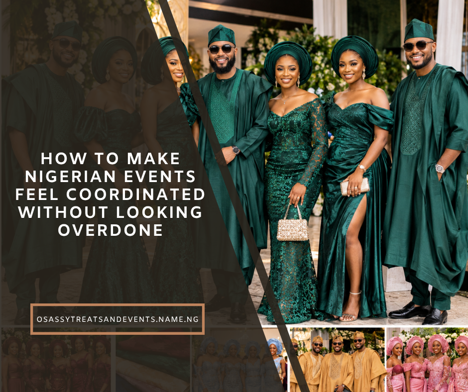
There is something special about walking into a Nigerian event and immediately knowing that everything belongs together.
The Aso-Ebi looks beautiful.
The décor complements it.
The food presentation fits the atmosphere.
The cake works with the colour palette.
Even the drinks look like they were deliberately chosen.
But there is a thin line between coordinated and overdone.
When every chair, flower, napkin, plate, backdrop, cake, drink bottle and outfit is forced into exactly the same colour, an event can start feeling visually crowded.
The goal isn’t for everything to match.
The goal is for everything to belong.
In 2026, Nigerian wedding and event styling continues to move toward more personalised experiences, with colour palettes being carried across Aso-Ebi, outfits, décor and other visual elements. At the same time, event-decoration coverage points to both bold colour combinations and minimalist elegance as active directions.
So how do you coordinate Aso-Ebi, food and décor without making the event look like one giant colour block?
Let’s break it down.
1. Start With a Colour Palette, Not One Colour
One of the easiest mistakes is choosing one colour and trying to put it everywhere.
For example:
Emerald green everywhere.
Emerald dresses.
Emerald tablecloths.
Emerald flowers.
Emerald napkins.
Emerald cake.
Emerald drinks.
Emerald backdrop.
Emerald chairs.
It can quickly become too much.
Instead, build a palette.
A simple event palette might contain:
Main colour
Emerald green
Supporting colour
Ivory
Accent colour
Gold
Neutral
Champagne or beige
Now you have much more flexibility.
The Aso-Ebi can carry the emerald.
The décor can use ivory and greenery.
Gold can appear in the table settings.
Champagne can appear in the cake, stationery or lighting.
Everything coordinates without everything being identical.
2. Let the Aso-Ebi Be One of the Main Visual Statements
Aso-Ebi already creates a strong visual impact because many guests are wearing a related fabric or colour.
That means your décor doesn’t necessarily need to compete with it.
If your Aso-Ebi is:
Deep burgundy with gold details
you don’t need burgundy flowers covering the entire venue.
Instead, you could use:
- Ivory flowers
- Greenery
- Gold accents
- Warm lighting
- Neutral table linen
- Small burgundy details
The clothing remains visually important without making the room feel saturated.
Aso-Ebi itself continues to function as a major part of the visual identity of Nigerian celebrations, while 2026 styling is increasingly allowing people to personalise silhouettes and finishing details even when they share the same fabric.
3. Choose the Aso-Ebi Before Finalising the Décor
If you’re planning a wedding, don’t choose your Aso-Ebi and décor completely separately.
They should influence each other.
For example:
Aso-Ebi
Royal blue
Décor
Ivory + silver + soft blue
This creates a balanced environment.
Or:
Aso-Ebi
Wine
Décor
Champagne + ivory + greenery
Or:
Aso-Ebi
Emerald
Décor
Cream + gold + natural greenery
The key is to let one element lead while the others support it.
4. Think About the Fabric, Not Just the Colour
This is something many people overlook.
Two fabrics can have the same colour but create completely different visual effects.
For example:
Emerald sequined lace
doesn’t feel the same as:
Emerald Aso Oke.
And:
Champagne lace
doesn’t necessarily look like:
Champagne satin.
Texture, embroidery, beading, sequins and sheen all affect how the colour appears.
Current Aso-Ebi guidance also stresses that fabric texture and finish can significantly change how a chosen colour looks in the finished outfit.
So don’t choose your event colours entirely from a phone screen.
Request physical fabric samples where possible.
5. Give the Bride and Groom Their Own Visual Space
A common problem at Nigerian events is having so many colours competing that the couple doesn’t visually stand out.
Your Aso-Ebi should create unity.
Your décor should create atmosphere.
But the couple should remain the visual focus.
For example, if the guests are wearing emerald green, the couple could use:
- Ivory
- Champagne
- Gold
- White
- A contrasting traditional colour
The exact combination depends on the wedding style.
The important thing is to create visual hierarchy.
Ask:
“When someone walks into the room, what should they notice first?”
Usually:
- The couple
- The main stage or ceremony area
- The overall atmosphere
- The guests
- Food and entertainment areas
Your design should support that order.
6. Coordinate the Food With the Event Without Making the Food Look Artificial
Food presentation is part of your event design.
But your food doesn’t need to match your Aso-Ebi literally.
If your wedding colours are burgundy and gold, you don’t need burgundy-coloured rice.
Instead, coordinate the presentation.
Use:
- Gold serving utensils
- Neutral serving dishes
- Burgundy menu cards
- Elegant food labels
- Matching table linen
- Fresh greenery
- Coordinated serving trays
The food itself should still look appetising and natural.
7. Use Drinks as a Design Element
This is especially useful for Nigerian events.
Instead of putting random soft drinks and water bottles on a table, create a deliberate drinks station.
For example:
Wedding palette
Sage + ivory + gold
Drinks
- Zobo
- Tigernut drink
- Pineapple-ginger
- Cucumber-mint
- Water
Use coordinated bottles, labels, trays and garnishes.
The drinks become part of the décor without having to be artificially coloured.
This is particularly useful for daytime weddings, garden events, corporate celebrations and wellness-focused events.
8. Don’t Try to Match Every Food Item to the Theme
Your event colour is not supposed to control the menu.
If the décor is:
Dusty pink + champagne
you don’t need pink jollof.
If the décor is:
Emerald + gold
you don’t need green desserts everywhere.
If the décor is:
Royal blue
you don’t need blue drinks.
Let food look like food.
Instead, make the serving environment coordinate with the event.
That usually looks more sophisticated.
9. Use One or Two Strong Décor Features
You don’t need a spectacular installation in every corner.
Choose a few areas to make visually important.
For example:
Feature 1
Wedding stage
Feature 2
Entrance
Feature 3
Cake/dessert table
Feature 4
Guest tables
Everything else can be simpler.
This creates contrast.
If every area is dramatic, nothing feels dramatic anymore.
10. Don’t Forget the Cake
Your wedding cake can help bring the entire visual theme together.
But it shouldn’t simply copy the décor.
For example:
Aso-Ebi
Wine
Décor
Champagne + ivory + gold
Cake
Ivory buttercream with subtle wine-coloured flowers and gold detailing
That is coordination.
The cake doesn’t need to be completely wine-coloured.
11. Use the 60–30–10 Colour Rule
A simple design technique can help prevent colour overload.
Try:
60% — Main neutral
Examples:
- Ivory
- Cream
- White
- Beige
30% — Main event colour
Examples:
- Emerald
- Wine
- Royal blue
- Terracotta
10% — Accent
Examples:
- Gold
- Silver
- Champagne
- Bronze
This isn’t a strict rule.
It’s simply a useful starting point.
For example:
60% cream + 30% emerald + 10% gold
can feel much calmer than:
33% cream + 33% emerald + 33% gold
because the latter can make every colour compete equally.
12. Consider the Venue Before Choosing the Palette
Your venue already has colours.
Look at:
- Walls
- Curtains
- Chairs
- Floors
- Ceiling
- Lighting
- Existing furniture
If the venue already has heavy gold décor and you add gold everything, the result may become visually overwhelming.
If the venue is minimalist and neutral, you have much more freedom.
Outdoor venue?
You may be able to use:
- Natural greens
- Terracotta
- Cream
- Earth tones
- Soft pinks
- Warm metallics
Ballroom?
You may want:
- Jewel tones
- Champagne
- Gold
- Ivory
- Deep blues
- Burgundy
The venue should be part of the colour decision.
13. Think About Daylight and Artificial Lighting
A colour can look completely different under:
Natural daylight
versus:
Warm reception lighting.
A fabric that looks champagne in daylight may appear almost gold under warm lights.
A dark burgundy can appear almost brown in certain lighting.
A pale pink may disappear against a bright white backdrop.
Always test your colours under the lighting conditions you’ll actually use.
This is particularly important when choosing:
- Aso-Ebi
- Stage décor
- Flowers
- Table linen
- Cake colours
- Signage
- Bridesmaid dresses
14. Coordinate the Table Settings
The guest table is where food, décor and Aso-Ebi visually meet.
You don’t need an elaborate tablescape.
Start with:
Linen
Neutral or complementary colour.
Plates
Simple white or elegant neutral tones.
Cutlery
Silver, gold or another deliberate finish.
Centrepiece
Flowers, greenery or candles.
Menu/Name Card
Use your event accent colour.
Napkin
This is a good place for a small pop of colour.
The goal is to make the table feel connected without covering it in decorative objects.
15. Be Careful With Gold
Gold is one of the most popular accents at Nigerian celebrations because it can instantly create a luxurious feeling.
But gold can also become too much.
Gold chairs.
Gold plates.
Gold chargers.
Gold cutlery.
Gold centrepieces.
Gold backdrop.
Gold cake.
Gold flowers.
Gold tablecloth.
At that point, the room may start feeling more metallic than elegant.
Instead, use gold selectively.
For example:
Gold + ivory + emerald
could mean:
- Ivory linen
- Emerald napkins
- Gold cutlery
- Gold candle holders
- Green and white flowers
The gold becomes an accent rather than the entire room.
16. Let Guests Have Some Styling Freedom
One of the beautiful things about Aso-Ebi is that guests can interpret the fabric differently.
Two people can wear the same fabric and create completely different outfits.
That individuality doesn’t necessarily weaken the event’s visual identity.
It can actually make the group look more interesting.
Current 2026 Aso-Ebi styling discussions increasingly emphasise personalised silhouettes and modern cuts while retaining the shared fabric connection.
So don’t feel that everyone has to have:
- The same dress
- The same neckline
- The same sleeves
- The same gele style
The shared fabric or colour already provides the connection.
17. Coordinate Food Stations With the Overall Experience
Food stations are becoming an increasingly useful way to add personality to Nigerian events.
Instead of hiding all the food behind one enormous buffet, consider dedicated stations such as:
Small Chops Station
Puff-puff, samosa, spring rolls and other favourites.
Grill Station
Suya, grilled chicken, fish or meat.
Traditional Food Station
Amala, ewedu, rice dishes or regional favourites.
Healthy Drinks Station
Zobo, tigernut drink, cucumber-mint and fruit-based drinks.
Dessert Station
Mini cakes, dessert cups, cookies and pastries.
The styling can coordinate with your event without forcing the food itself to match the colour scheme.
18. Don’t Make Every Sign Say the Couple’s Names
Personalisation is useful.
But too much branding can make a wedding feel like a corporate conference.
You don’t need:
“Princess & David”
on every:
- Table
- Wall
- Napkin
- Bottle
- Chair
- Plate
- Cake
- Sign
Choose a few strategic places.
For example:
- Welcome sign
- Wedding programme
- Cake topper
- Dance floor
- Photo backdrop
That’s enough.
19. Use Repetition Instead of Duplication
This is one of the easiest ways to make an event feel professionally designed.
Instead of repeating the exact same decoration everywhere, repeat a visual idea.
For example:
Gold
Appears in:
- Cutlery
- Cake details
- Signage
- Candle holders
Greenery
Appears in:
- Stage
- Table centrepieces
- Cake
- Welcome sign
Burgundy
Appears in:
- Aso-Ebi
- Napkins
- Menu cards
- Small floral accents
The elements don’t have to be identical.
They simply need to repeat enough to create visual connection.
20. Create a Simple Event Style Guide
If several vendors are involved, this can save you a lot of trouble.
Create a one-page document containing:
Event colours
Example:
- Ivory
- Emerald
- Gold
Accent
- Champagne
Floral direction
- White flowers
- Greenery
Table style
- Ivory linen
- Gold cutlery
Cake
- Ivory buttercream
- Emerald floral accents
Drinks
- Clear bottles
- Minimal emerald labels
Send the same guide to:
- Decorator
- Baker
- Caterer
- Stationery designer
- Florist
- Photographer/content creator
This helps everyone work from the same visual direction.
21. Don’t Forget the Photographs
Your event needs to look good in real life and in photographs.
Think about where your strongest photos will happen.
Couple portraits
Choose a clean background.
Group Aso-Ebi photos
Make sure the background isn’t so colourful that it competes with the guests.
Food photos
Keep serving areas clean and uncluttered.
Cake photos
Give the cake enough space.
Guest photos
Create a few attractive areas where people naturally want to take pictures.
This is particularly relevant as Nigerian weddings increasingly emphasise personalised, experience-driven celebrations and social-media-friendly event design.
22. Three Example Nigerian Event Palettes
Palette 1: Emerald, Ivory & Gold
Aso-Ebi
Emerald
Décor
Ivory + greenery
Accent
Gold
Food presentation
White serving dishes + gold details
Cake
Ivory buttercream + subtle emerald flowers
Drinks
Clear bottles + green/white labels
Overall feeling: Elegant and fresh.
Palette 2: Wine, Champagne & Cream
Aso-Ebi
Wine/burgundy
Décor
Cream + champagne
Accent
Gold
Food presentation
Neutral servingware
Cake
Cream + subtle wine details
Drinks
Clear bottles + burgundy labels
Overall feeling: Warm and sophisticated.
Palette 3: Terracotta, Sage & Cream
Aso-Ebi
Terracotta
Décor
Cream + sage greenery
Accent
Bronze
Food presentation
Wood + neutral servingware
Cake
Cream buttercream + botanical decoration
Drinks
Natural fruit colours + minimal labels
Overall feeling: Relaxed, modern and especially suitable for an outdoor celebration.
Terracotta, sage, mocha and other earthy or softened shades are among the colour directions appearing in 2026 Nigerian Aso-Ebi and event styling coverage.
What Not to Do
Avoid:
❌ Matching every single item to the Aso-Ebi
❌ Using five or six major colours
❌ Choosing colours only from Instagram
❌ Ignoring the venue’s existing colours
❌ Forgetting lighting
❌ Making the buffet excessively decorative
❌ Using artificial food colouring simply to match décor
❌ Covering every surface with flowers
❌ Branding every object with the couple’s names
❌ Choosing a trendy colour that neither partner actually likes
The “Before You Buy Anything” Checklist
Before ordering décor or Aso-Ebi, ask:
☐ What feeling do we want the event to have?
☐ What is our main colour?
☐ What are our supporting colours?
☐ What is our accent colour?
☐ What colour is the venue?
☐ What fabric are we using for Aso-Ebi?
☐ How does the fabric look in daylight?
☐ How does it look under event lighting?
☐ What colours will the couple wear?
☐ What will the cake look like?
☐ How will the food be presented?
☐ What will the drinks station look like?
☐ Where will the strongest photographs happen?
☐ Which areas actually need heavy décor?
☐ Which areas can remain simple?
Final Thoughts
A beautiful Nigerian event doesn’t need every detail to match.
It needs relationship between the details.
Your Aso-Ebi can provide the colour.
Your décor can provide the atmosphere.
Your food can provide the experience.
Your cake can provide the centrepiece.
Your drinks can add personality.
Your lighting can bring everything together.
And your guests bring the energy.
That’s the difference between an event where everything simply has the same colour and an event where everything feels intentionally designed.
So before you tell your decorator:
“I want everything to match my Aso-Ebi.”
Try saying:
“I want everything to complement my Aso-Ebi.”
That one change can make a huge difference.
Frequently Asked Questions
Should my wedding décor match my Aso-Ebi?
It doesn’t have to match exactly. A coordinated palette usually gives you more flexibility and can prevent the event from becoming visually overwhelming.
How many colours should a Nigerian wedding have?
There is no fixed number, but using one main colour, one or two supporting colours and a small accent palette is a useful starting point.
Should the food match the wedding colours?
The food itself doesn’t need to match. Focus instead on coordinated servingware, labels, table settings and presentation.
Should the cake match the décor?
The cake should complement the décor rather than necessarily copy it. Small colour or floral details can connect the cake to the overall design.
What Aso-Ebi colours are popular in 2026?
Current Nigerian wedding coverage includes emerald, burgundy/wine, champagne, royal blue, mocha, terracotta, sage, dusty rose and other rich or softened shades. Trends vary by event and region, so couples should also consider fabric, venue and personal preference.
How can I make a low-budget event look coordinated?
Choose a small colour palette and repeat it strategically. Coordinated napkins, signage, flowers, food labels and table settings can create a strong visual identity without decorating every surface.
SEO Details
SEO Title:
Aso-Ebi, Food & Décor: How to Coordinate a Nigerian Event
Meta Description:
Learn how to coordinate Aso-Ebi, food, drinks and décor for a beautiful Nigerian event without making everything look overly matched or crowded.
Primary Keyword:
Aso-Ebi food and décor
Secondary Keywords:
- Nigerian event decoration ideas
- Aso-Ebi wedding décor
- Nigerian wedding colour combinations
- Nigerian wedding planning
- Nigerian wedding décor ideas
- how to coordinate Aso-Ebi
- Nigerian wedding food presentation
- Nigerian wedding colour palette
- Owambe décor ideas
- Nigerian event styling
Suggested URL Slug:/aso-ebi-food-decor-nigerian-event